Kitchen Expansion
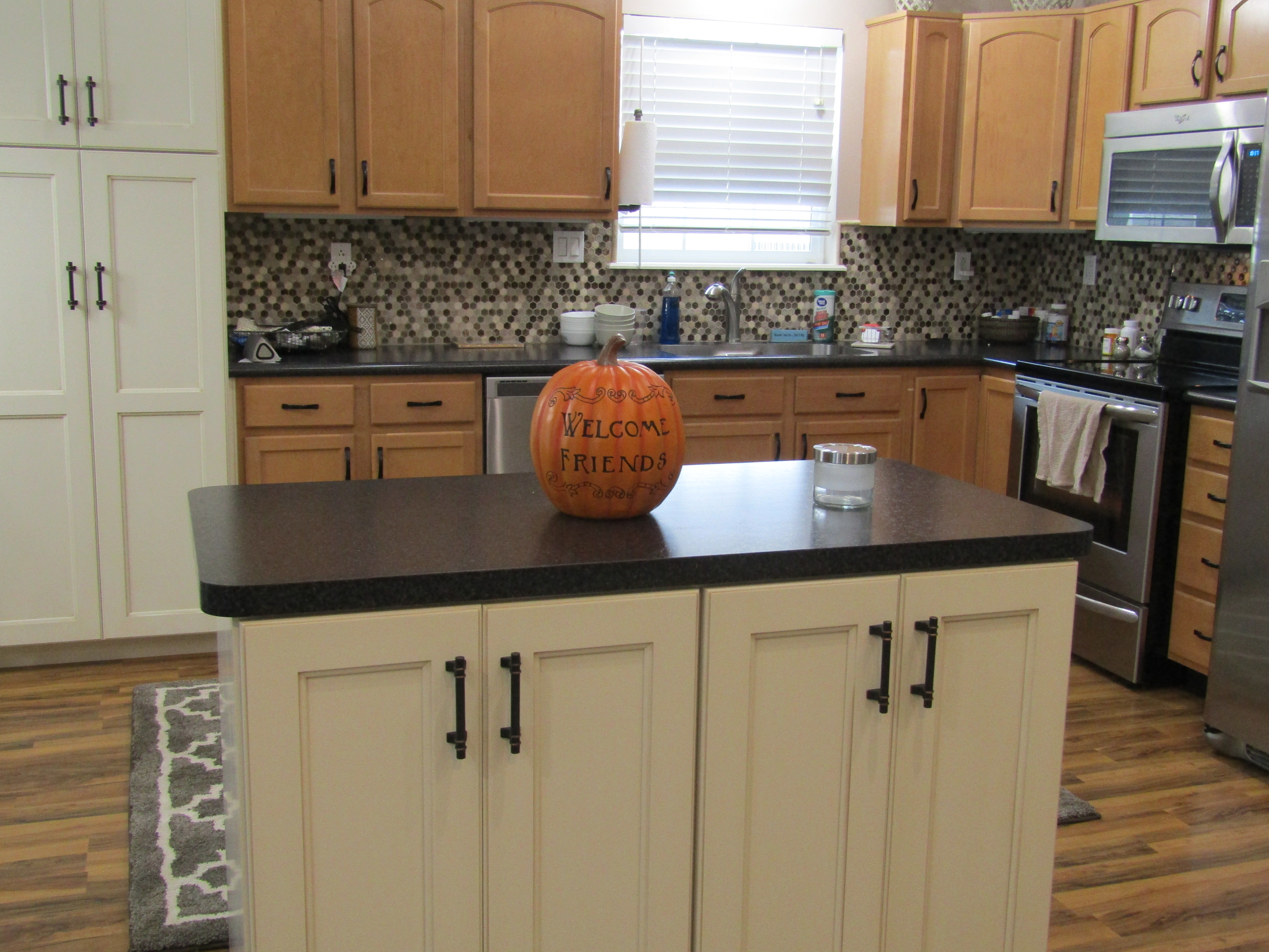
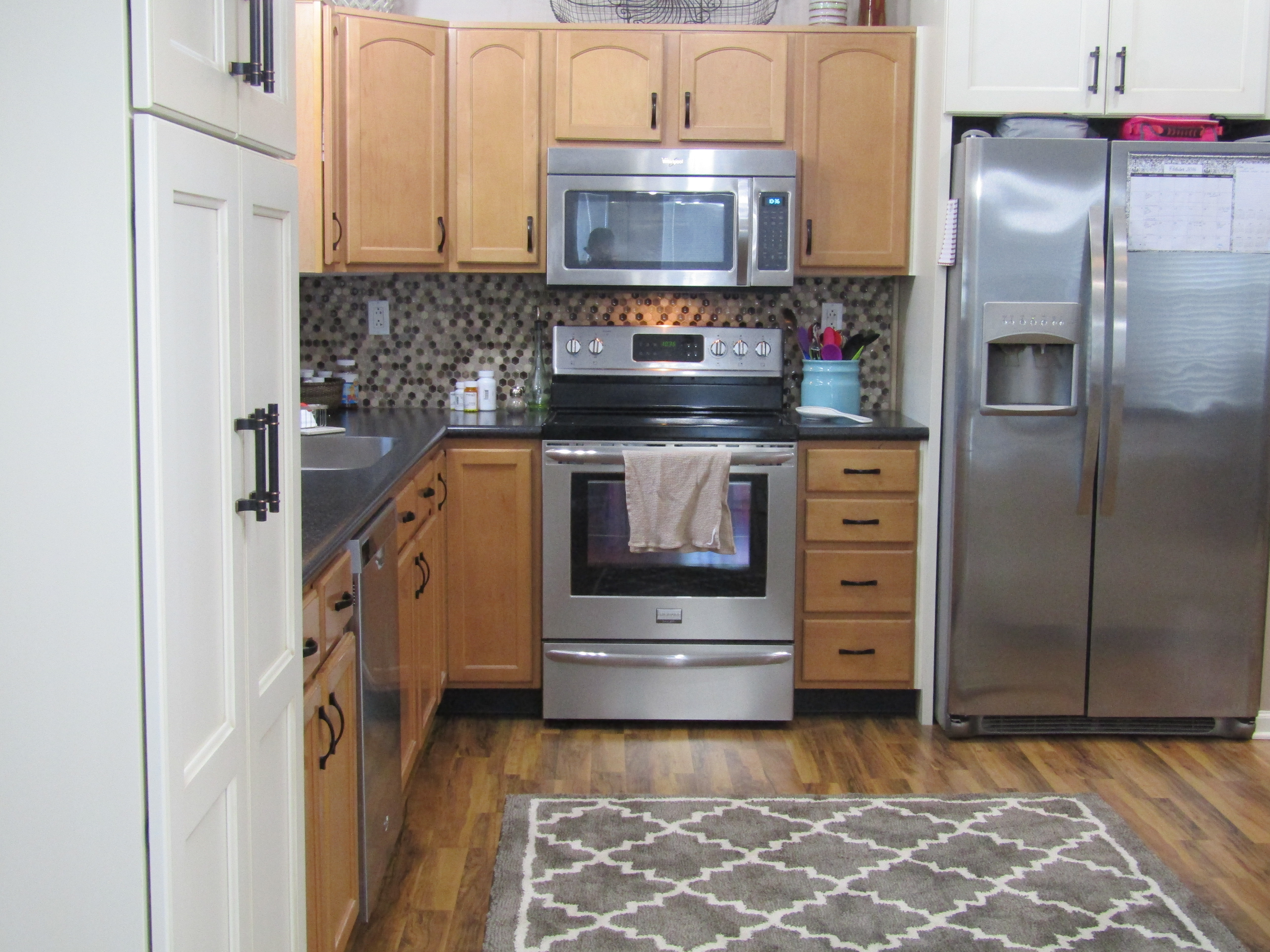
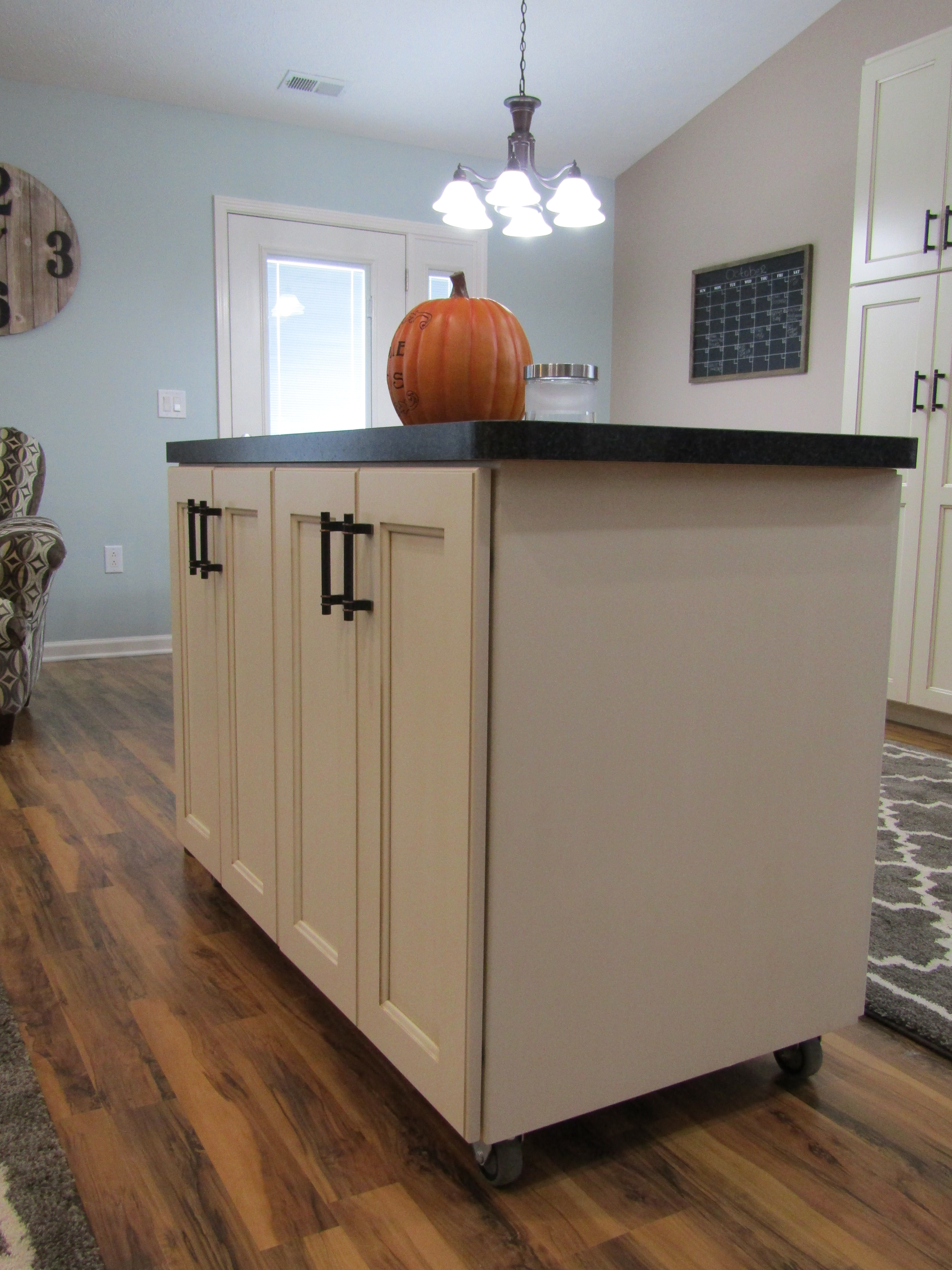
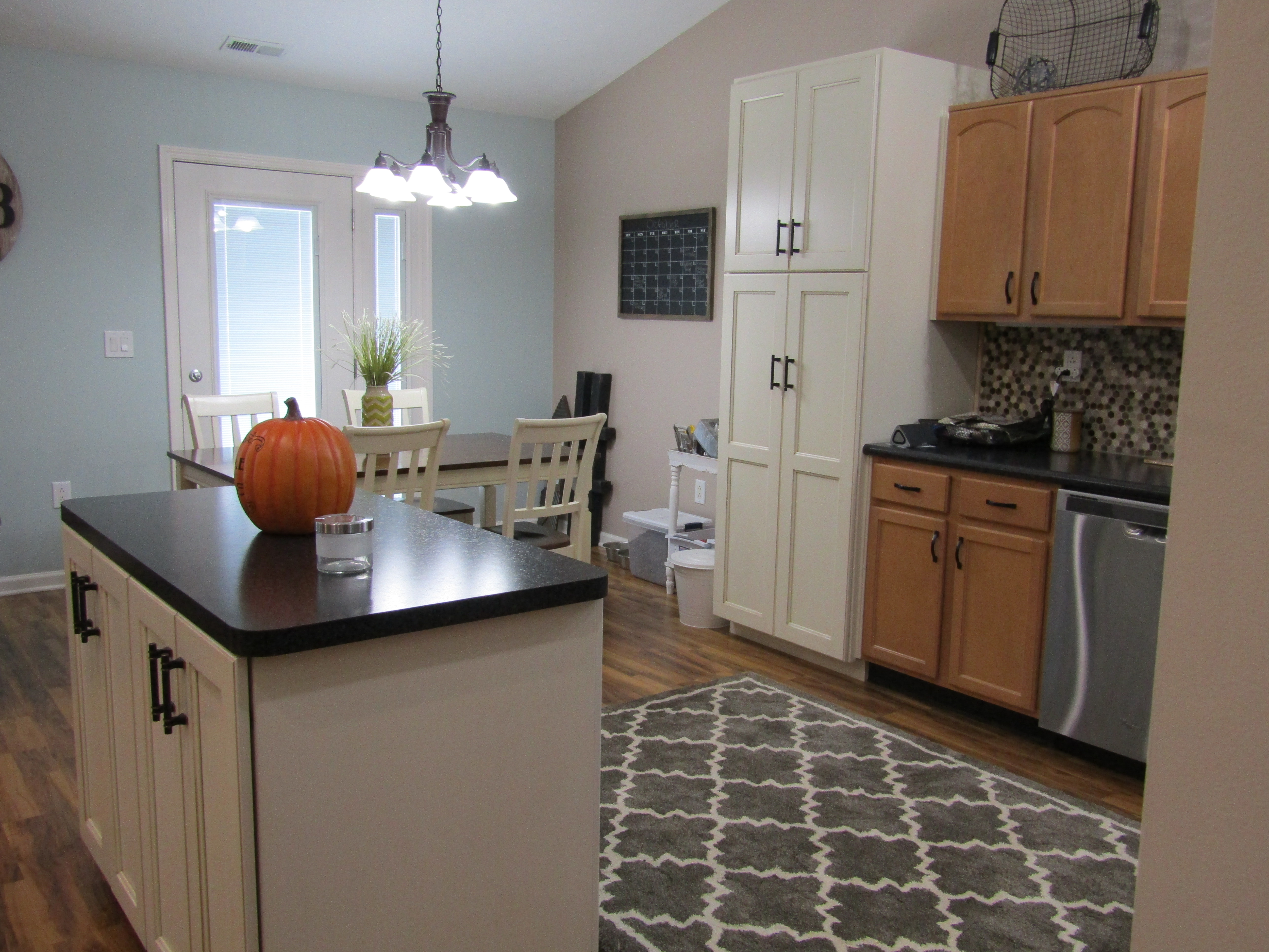
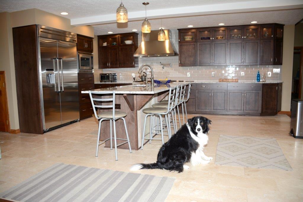
Bill and Karen C., long-time customers of Bradford Builders, asked us to help them make their kitchen larger and more workable for them. They both like to cook, but the existing layout was not conducive to having more than one person in the kitchen at one time.
So the kitchen space was expanded by removing a hallway that ran behind the kitchen to the garage. Eliminating this wall created structural challenges that required a new footing, new posts, and a new longer structural beam to hold up the load-bearing second floor wall. Then it became obvious that the wall between the kitchen and family room should be removed to add even more space to the new kitchen and open it up to the family room. The decision to do this was made on a Friday and on Monday the new plan was put into action.
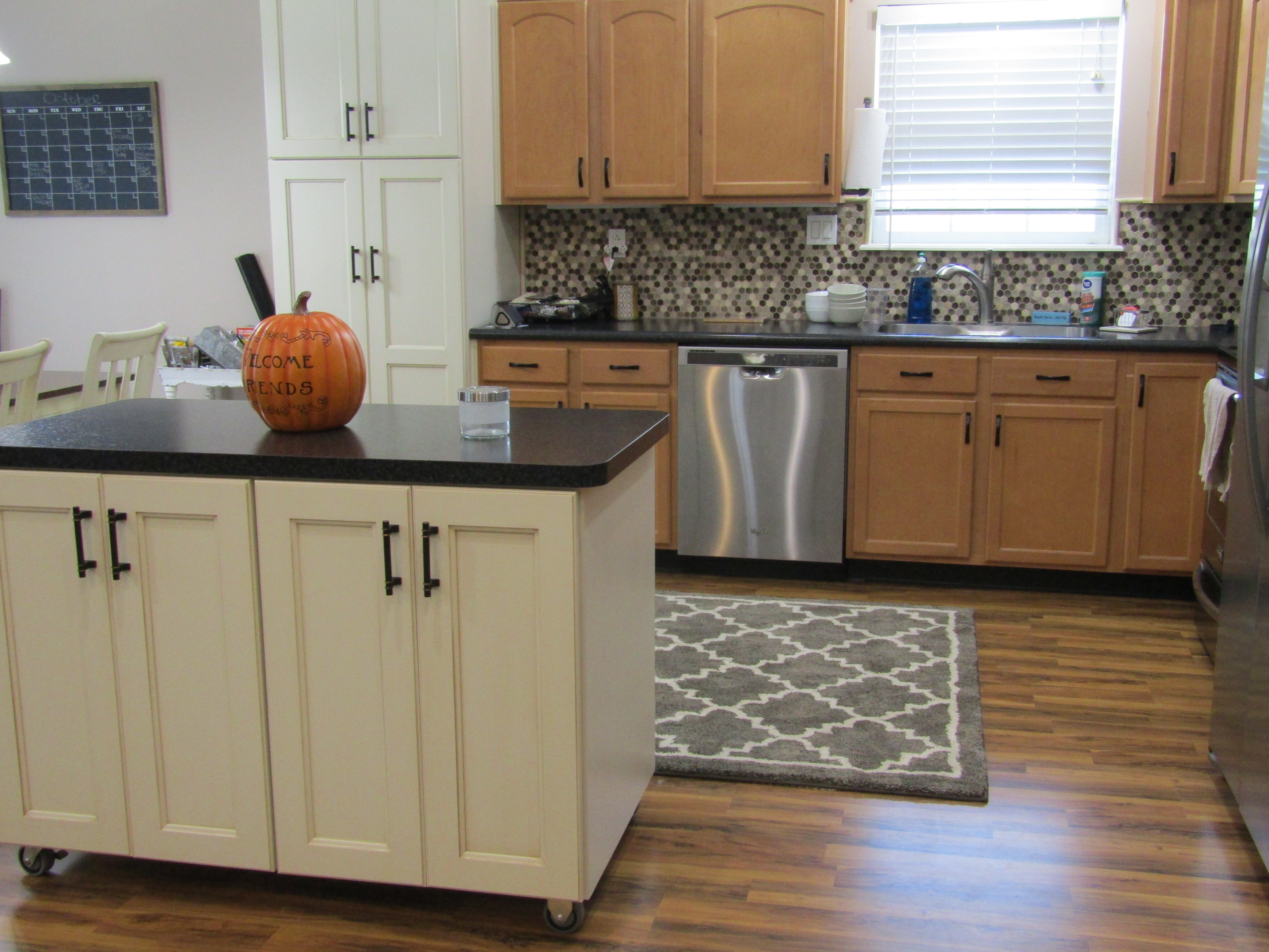
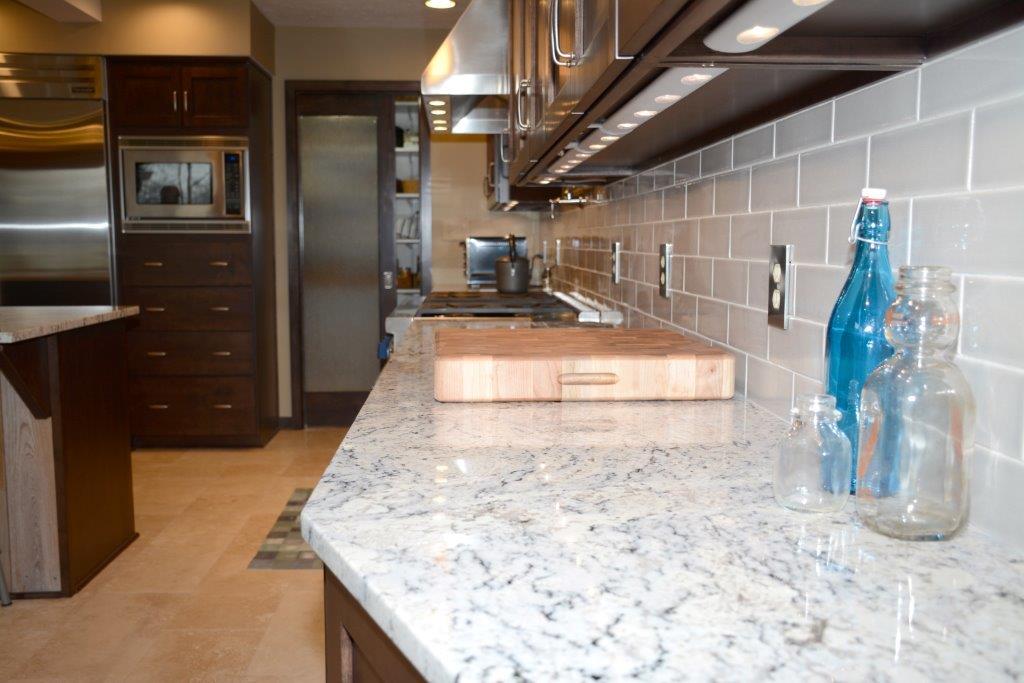
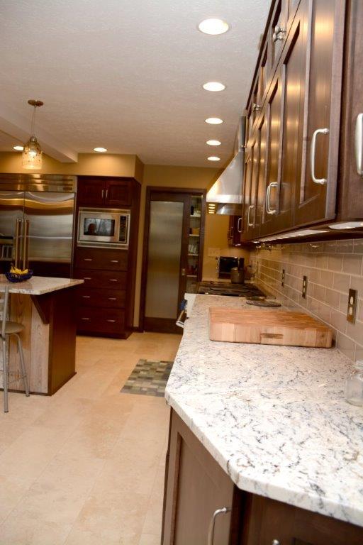
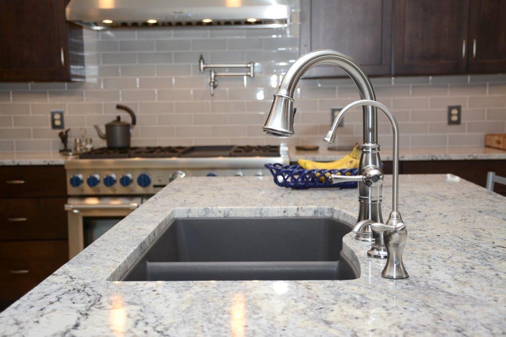
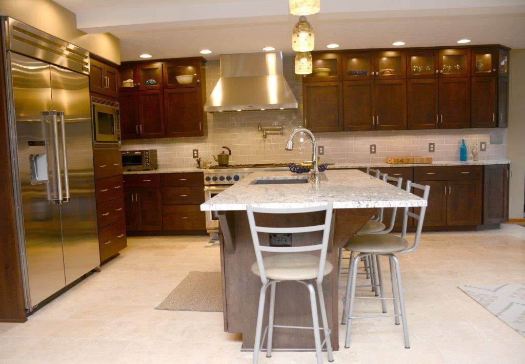
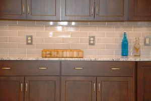
In addition to increased space, Bill and Karen wanted to give their kitchen a more updated look while keeping some traditional elements. They replaced light oak cabinets with a darker, shaker style, full overlay cabinet. White ice granite countertops, stainless steel appliances, travertine floor tiles, and a subway tile backsplash add to the up-to-date look.
Karen’s favorite features of the new kitchen include the pot filler above the cook top—“I love that thing and use it more than I thought I would”—and the layout of the kitchen. “The layout has changed our lives,” she said. “It’s so convenient to cook and work in the kitchen.”
Karen’s answer when asked if they would do anything differently? “Not a thing!”
Kitchen Remodel
It was time for Steve and Jan B. of Greenfield to modernize their kitchen by replacing the cabinets, plumbing fixtures, appliances, and flooring and removing the wall separating the kitchen from the family room. They called Bradford Builders, knowing that by working with owner Brad Arthur, they could maximize the efficiency of their space and their remodeling dollars. Steve and Jan had worked with Bradford Builders several times before and had always been pleased with the results.
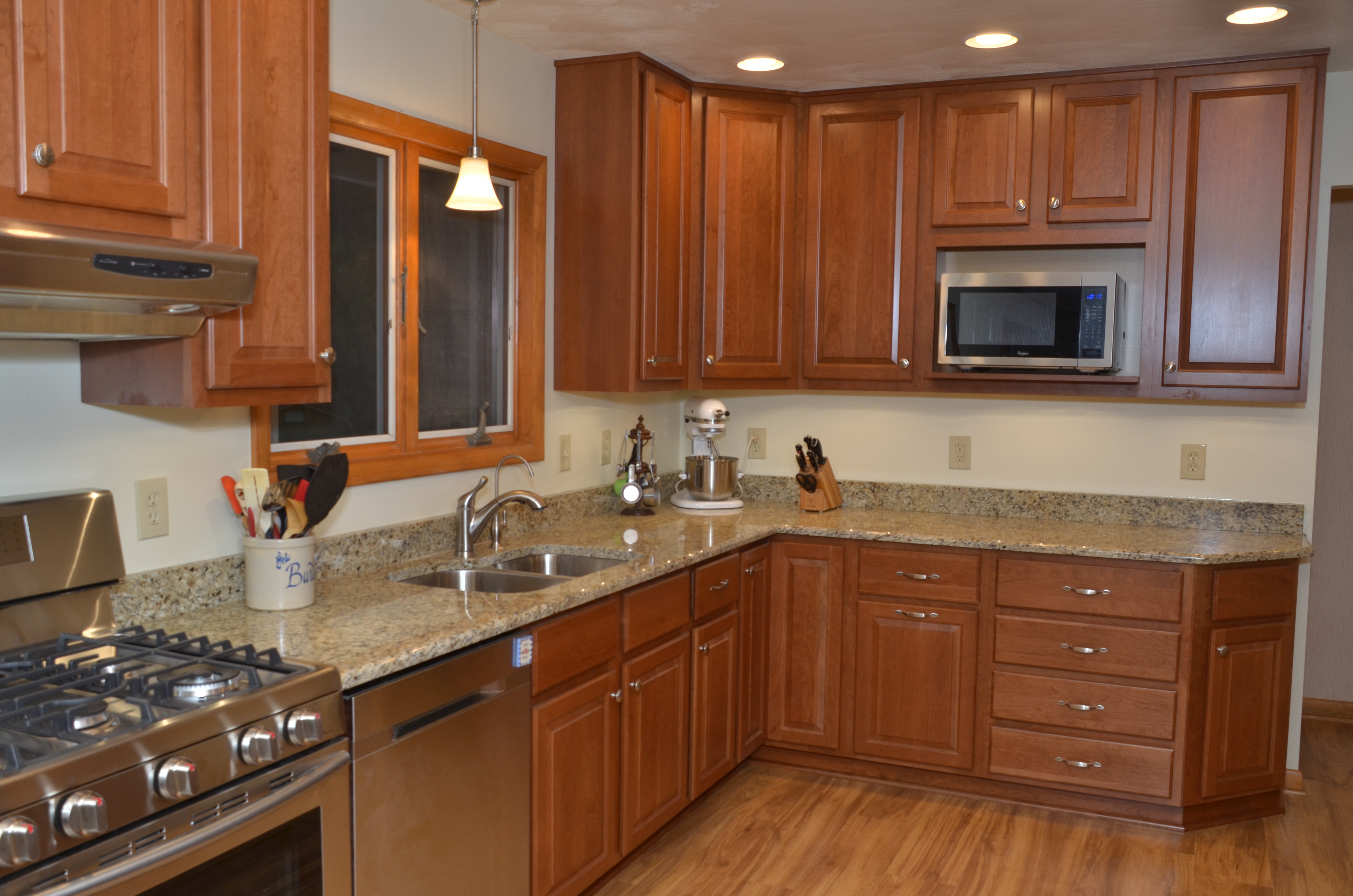
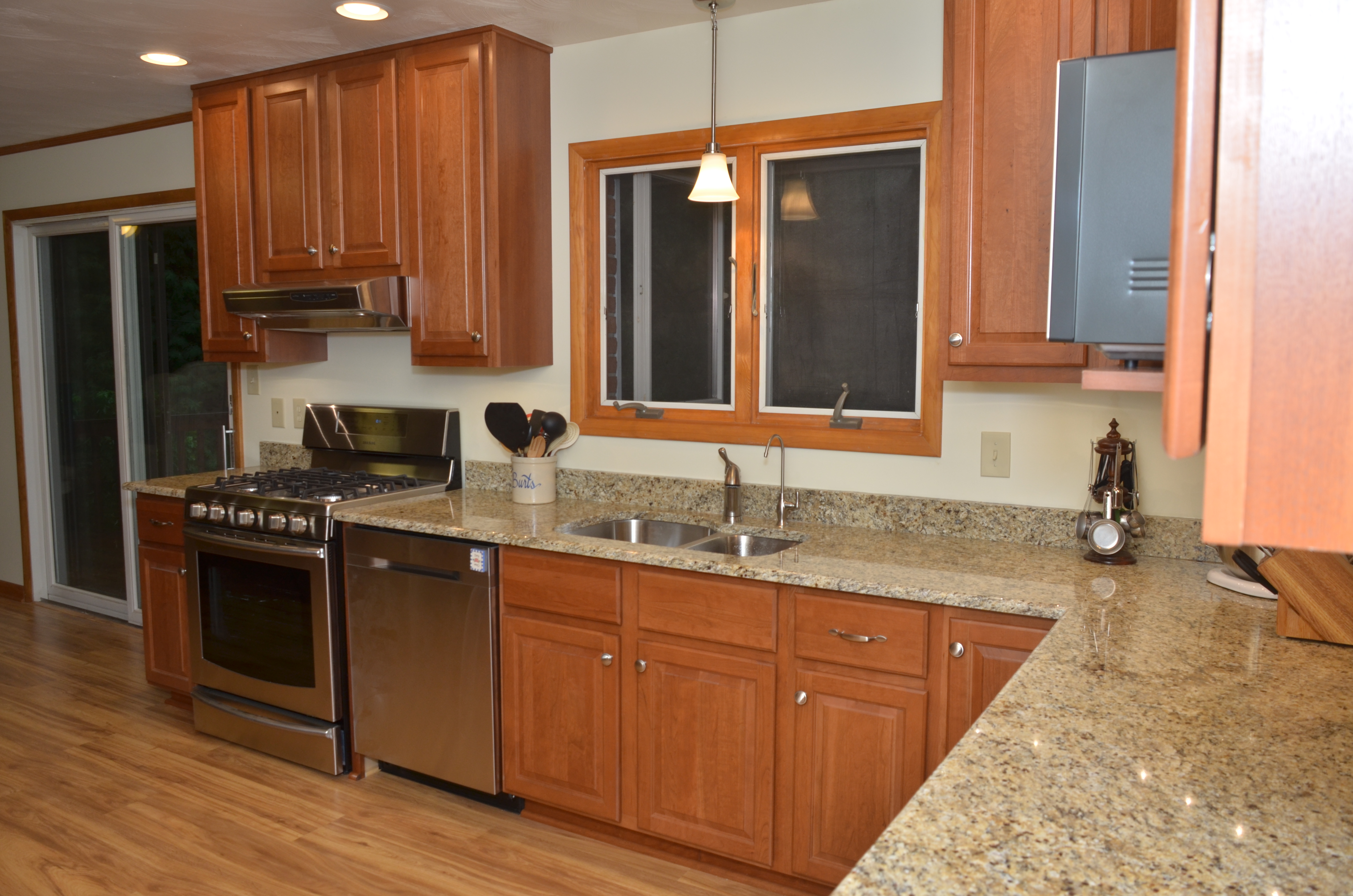
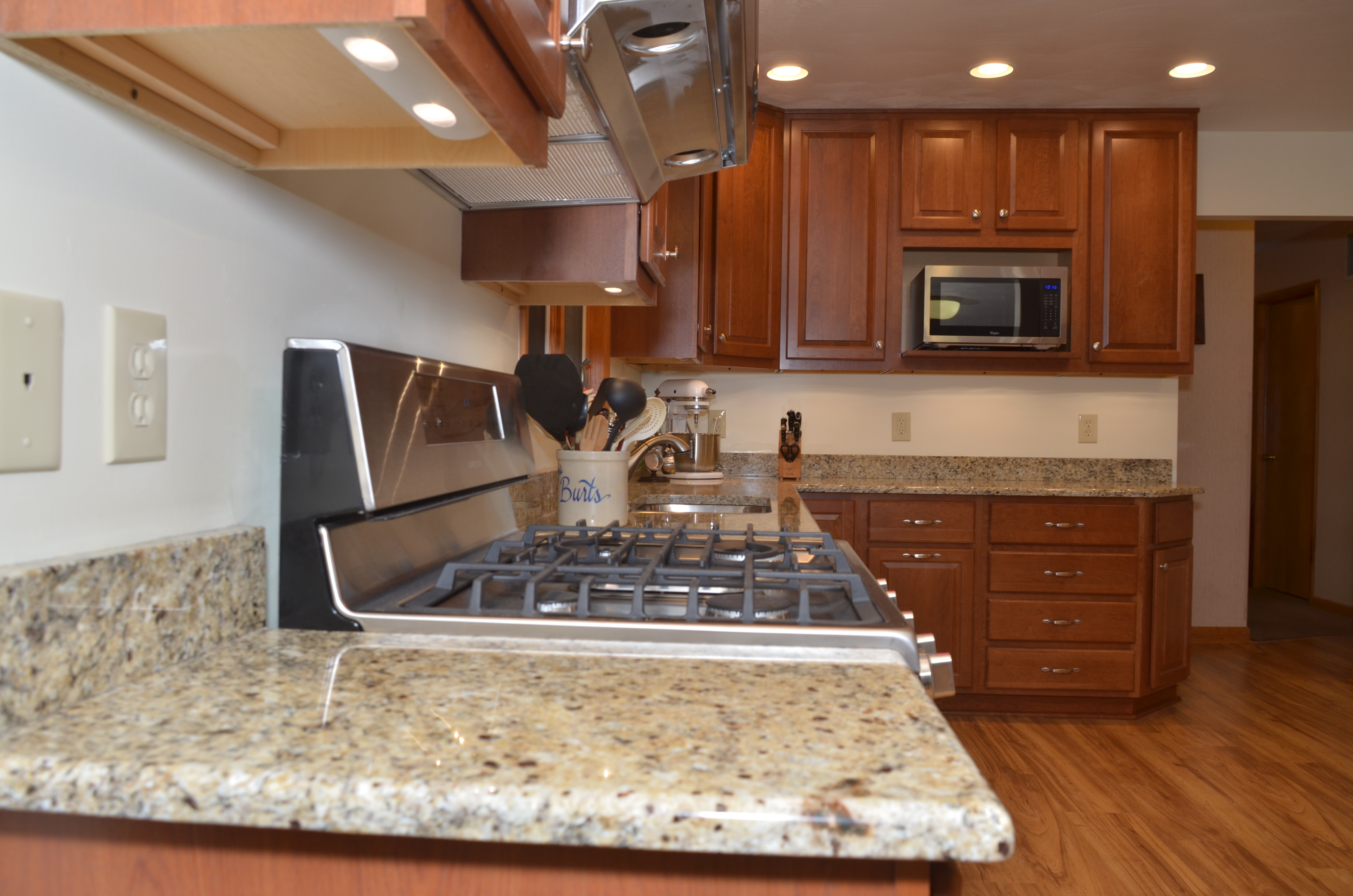
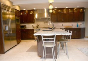
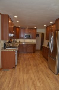
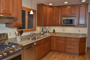
The kitchen workspace used to be dominated by the refrigerator, which practically blocked the opening from the kitchen to the hallway. In the new layout, the refrigerator is conveniently located across from the cooktop, with plenty of countertop to the side for a coffee bar, the toaster, and other small appliances. You’ll notice the cabinets in this area are further above the countertop than is standard, specifically to leave room for coffee and beverage servers the family uses during their get-togethers. The heavy lifting of meal prep is handled by a 5’ expanse of countertop below the microwave with multiple electrical outlets within reach and lit by energy-efficient LED under-cabinet lights.
The cherry cabinets feature a cider-color finish. The cabinet design includes one standard drawer stack and a second drawer stack of extra-deep and extra-wide drawers for storing large cookware, small kitchen appliances, or anything that might be hard to reach at the back of a standard cabinet. There is a super Susan in one corner. A super Susan has two shelves that rotate independently without the center bar and plastic shelves, offering more storage and preventing items from falling and getting caught behind the shelves.
During meal prep, the family can be close by without actually being in the kitchen now that the kitchen and family room have been joined as one warm, comfortable room with a fireplace opposite the kitchen. This also adds plenty of room for seating during meals, allowing more people to share the same room and easily talk with one another.
